Tuesday, July 20, 2010

I am changing my blog to http://obscuredlight.blogspot.com/

Thank you

That is all.

Tuesday, April 27, 2010

test


this is a test to see if something I did will look right on the web, specifically on blogger. I did this for a "challenge" on the art order blog.

Sunday, February 7, 2010

meh


So I am alive and ok. It has been a while since I posted here. I have been getting into posting more on deviantart.com and conceptart.org. I have done some stuff but I thought I'd post something I did a few months ago as a little practice. I did this in about 2 hours over 2 separate days. I think the layering of wet on dry adds contrast better than any wet on wet.

Friday, August 7, 2009

logos


I figured I would post some comps for someone who wants to start a non-profit organization. It's a good cause, and I like the idea. She was a professional motocross racer who got injured, and figured it would be good for kids to take up the sport as a way to keep them off the streets. I wish her the best of luck and hope she has a good plan, because I could see the corporate types not sharing her passion for a fun yet bruising sport. So far these images are copywrited to me, but if she decides to use them I will transfer the copywrites.

Friday, July 17, 2009

sketches


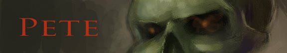
Here are some sketches I did. The first three are from Bills class even though I'm not enrolled. I enjoy watching bill draw, it's always a reminder on how to simplify... something I always need. The faces I found on line while I was bored at work the other day.

Friday, June 19, 2009

Me??


So I'm supposed to be becoming a professional artist. Really? I graduated, I got good grades, people liked my work, but for some reason I can't seem to do anything at a level above mediocre. Even when I try to do things I have done well before, I seem to be able to have problems. For instance, I painted an image in acrylics, when I scanned it the texture was causing a glare. Alright, I expected this to happen to some extent. So I simply applied some matte medium to the surface and it should fix the problem, right? Nope. Not only was there a glare, but it streaked. Damn. I then figured that I could maybe paint it in oil on top, you know to just finish it off. Sounds reasonable, but I still wanted to get rid of the glare to scan it. Enter the "sureguard" retouch varnish with the vellum surface. Bam! Done! But wait, no I'm not done because it looks like oil in the varnish was white paint. What The FUCK?? Alright, enter the mineral spirits to wipe off some of the varnish. Nope. After it evaporated it looked just as bad. Hmmm... If it looked ok when wet, it should look ok with Damar varnish. Well, maybe not ok, but a step in the right direction... except that it's now shiny. Not many options at this point, so REenter the vellum surfaced varnish and.... Well, at least it doesn't have a glare. This all wouldn't be too disapointing if I didn't paint in black and white (see the above comment about failing to do anything well), but I spent the better part of 30 minutes trying to get the values on the rock looking pretty good, and EACH layer lightened the blacks. Yup, even the "clear" varnish lighted the darks, not pure black, by about a 10%-15%. The bright side is that I planned on repainting it in oil to get the gradations looking better, so now there is no reason NOT to repaint it. Here is the final acrylic, on location, after matte medium, and varnish x3, photoshopped to get the levels where they should be. sometimes I hate life

Friday, March 27, 2009

some guy..


So I painted some guy in a workshop a month and a half ago, and it's dry now (and has been for a month and a half). For this I only used 4 colors, and I forgot how close you can get with those four colors to natural skin tones.

Friday, January 30, 2009

Day 2


So I planned on getting 2 hours of paint time today, but for some reason I barely got 1 in. I've come to realize the Galkyd dries quickly, mabe it's just the 50 degree shade, but I think a little should go a long way. My biggest problem is I can't NOT see detail. This painting is small, mabey half size of what I actually see, but I still want to put all of the interest the sculptors spent their time on. I ended up spending most of the time today stuck in the minutia of the Palace, and trying to figure out the different greens of the different foliage. Oh well, I'll go back on Monday before I have to go to work and put in another hour or so. I'm not sure when I'll stop since I have no plans to finish. Hmm...

Thursday, January 29, 2009

Practice


Since I took an Acrylic painting class I have been neglecting oils, so I figured I would do some location painting to get the kinks out. I ended up getting to the location about 40 minutes before I had to go to work, and I decided to just make a sketch. As I was painting this I figured I could just go back tomorrow. With that in mind, I figured I might as well put up the embarrasement of today (I even got a compliment from an old guy).

This is obviously on location, in the 50 degree shade with no jacket, on a sidewalk, at noon, in 30 minutes, on an 8x10 cheap canvas board.

On a different but similar note (?), I ran out of liquin and tried Galkyd. This stuff is like liquid awesome, provided awesome is the consistency of honey, dries in hours, allows you paint on while tacky, and dries to a semi-gloss. This and Titanium white Alkyd let the painting dry to the touch in about three hours. Nice.

Wednesday, January 21, 2009

details


Here are two detail shots. By the way, I am calling this painting, "Sneak attack". It amused me to have an angel lamenting the death of a mortal only to become a victim of the destroyer of all.

Tuesday, January 20, 2009

uh... hmmm....


Ok. I'm really not good at this bloging thing. I had my suspicions before I even started, but now they are officially confirmed. I have been busy since I last posted. I graduated, got a job (not in the field I graduated from), got a girlfriend, got bills, and I still need to figure out how to paint better. According to internet questionaires I'm under a lot of stress, I'm depressed, I'm anorexic (?), and I have an I.Q. on par with Albert Einstein. I'm sure some parts are true to a certain extent, but come on, anorexic?

Anyway. I submitted some work to the Spectrum anual competition. I doubt I willl get in though. My printer craped out on me and won't print full page images on nice paper without faulting. I had some copies made, but they turned out sub-par. I still tried though, so I'm a winner in someones book, right? Reguardless, here is the image I sent in. I tried to paint it entirely in acrylics, but the background clouds were atrocious so I had to repint that. I then touched up the reast of the image with oils. I miss that medium. Now if I could only find a GOOD way of painting acrylics on top of the oils, I would be very pleased... until I messed something up.

On a personal note. I will try to post more often for the sake of doing something productive outside the realm of my inner self.

Wednesday, August 27, 2008

8/27


I met Todd Lockwood for the second time this past summer, and this time I both knew who he was, and had a portfolio to show him. The short form is that I have plenty of inadequacies to work on. My composition and color handling stood out most of all on the list. I would like to think I trained myself classically, but in doing so I neglected what modern technology has provided for artists since the French Romantics. Lens distortion and off level horizons are what people expect to see in an image, especially one completed digitally. Gone are the days where action is explained by a person seeming to move. Now in order to convey a sense of movement, every element has to be displayed in a dynamic way. It isn't enough to have an explosion, there needs to be debris flying past our heads or else it will look quaint. "Oh look, that building just blew up. Can you pass the catchup?". It is with a heavy heart that I enter into the illustration world where subtlety is an assault on the senses and normalcy is garish campiness. This illustration of the undead is an attempt at looking at my art with a more modern aesthetic. No reference was used so I had to look at the image first, and the props became reasons instead of ideas. Anatomy became secondary, physics took a flying leap, and I think this is one of my best illustrations to date. I'm pretty happy with the picture, but the jury's still out on the means.

3,4,5


Here are some more quick portraits, times are as noted in the image.

Thursday, August 21, 2008

in progress


Personal project I'm working on

1,2


I decided to do a sketch a day, digitally. My plan is to work on portraits and digital work in general, and to do them in an hour or less. It should also be good to loosen up first thing in the morning.

Wednesday, August 20, 2008

In the Beginning...

As a person who enjoys the world in analogue, this blog is to promote my art without a gallery to speak of. As such, I ask you to leave any messages, critiques, questions, etc. that you may have, for this is the only way I can commune with the cyber you.