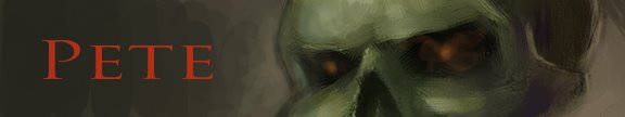

I met Todd Lockwood for the second time this past summer, and this time I both knew who he was, and had a portfolio to show him. The short form is that I have plenty of inadequacies to work on. My composition and color handling stood out most of all on the list. I would like to think I trained myself classically, but in doing so I neglected what modern technology has provided for artists since the French Romantics. Lens distortion and off level horizons are what people expect to see in an image, especially one completed digitally. Gone are the days where action is explained by a person seeming to move. Now in order to convey a sense of movement, every element has to be displayed in a dynamic way. It isn't enough to have an explosion, there needs to be debris flying past our heads or else it will look quaint. "Oh look, that building just blew up. Can you pass the catchup?". It is with a heavy heart that I enter into the illustration world where subtlety is an assault on the senses and normalcy is garish campiness. This illustration of the undead is an attempt at looking at my art with a more modern aesthetic. No reference was used so I had to look at the image first, and the props became reasons instead of ideas. Anatomy became secondary, physics took a flying leap, and I think this is one of my best illustrations to date. I'm pretty happy with the picture, but the jury's still out on the means.

No comments:
Post a Comment